Chapter 8 Poisson regression & analysis of curved effects
This exercise deals with modelling incidence rates using Poisson regression, already briefly covered by Janne and Esa in this course. Our special interest is in estimating and reporting non-linear or curved effects of continuous explanatory variables on the hazard rate , i.e. the theoretical incidence rate of the outcome.
We analyse the testisDK data found in the Epi package. It contains
the numbers of cases of testis cancer and mid-year populations
(person-years) in 1-year age groups in Denmark during 1943-96. In this
analysis age and calendar time are first treated as categorical but
finally, a penalized spline model is fitted.
8.1 Testis cancer: Data input and housekeeping
- Load the packages and the data set, and inspect its structure:
## Loading required package: nlme## This is mgcv 1.9-4. For overview type '?mgcv'.## 'data.frame': 4860 obs. of 4 variables:
## $ A: num 0 1 2 3 4 5 6 7 8 9 ...
## $ P: num 1943 1943 1943 1943 1943 ...
## $ D: num 1 1 0 1 0 0 0 0 0 0 ...
## $ Y: num 39650 36943 34588 33267 32614 ...## A P D Y
## Min. : 0.0 Min. :1943 Min. : 0.000 Min. : 471.7
## 1st Qu.:22.0 1st Qu.:1956 1st Qu.: 0.000 1st Qu.:18482.2
## Median :44.5 Median :1970 Median : 1.000 Median :28636.0
## Mean :44.5 Mean :1970 Mean : 1.812 Mean :26239.8
## 3rd Qu.:67.0 3rd Qu.:1983 3rd Qu.: 2.000 3rd Qu.:36785.5
## Max. :89.0 Max. :1996 Max. :17.000 Max. :47226.8## A P D Y
## 1 0 1943 1 39649.50
## 2 1 1943 1 36942.83
## 3 2 1943 0 34588.33
## 4 3 1943 1 33267.00
## 5 4 1943 0 32614.00
## 6 5 1943 0 32020.33- There are nearly 5000 observations from 90 one-year age groups and 54 calendar years. To get a clearer picture of what’s going on, we do some housekeeping. The age range will be limited to 15-79 years, and age and period are both categorized into 5-year intervals – according to the traditional, time-honoured practice in epidemiology and demography.
8.2 Some descriptive analysis
Computation and tabulation of incidence rates
- Tabulate numbers of cases and person-years, and compute the
incidence rates (per 100,000 y) in each 5 y \(\times\) 5 y cell using
stat.table(). Take a look at the structure of the thus created object
tab <- stat.table(
  index = list(Age, Per),
  contents = list(
    D = sum(D),
    Y = sum(Y / 1000),
    rate = ratio(D, Y, 10^5)
  ),
  margins = TRUE,
  data = tdk
)
str(tab)
## 'stat.table' num [1:3, 1:14, 1:12] 10 773.81 1.29 30 813.02 ...
## - attr(*, "dimnames")=List of 3
## ..$ contents: Named chr [1:3] "D" "Y" "rate"
## .. ..- attr(*, "names")= chr [1:3] "D" "Y" "rate"
## ..$ Age : chr [1:14] "[15,20)" "[20,25)" "[25,30)" "[30,35)" ...
## ..$ Per : chr [1:12] "[1943,1948)" "[1948,1953)" "[1953,1958)" "[1958,1963)" ...
## - attr(*, "table.fun")= chr [1:3] "sum" "sum" "ratio"The table is too wide to be readable as such. A graphical presentation is more informative.
- From the saved table object
tabyou can plot an age-incidence curve for each calendar period separately, after you have checked the structure of the table given in the previous item, so that you know the relevant dimensions in it. There is a functionrateplot()inEpithat does default plotting of tables of rates (see the help page ofrateplot)
par(mfrow = c(1, 1))
rateplot(
  rates = tab[3, 1:nAge, 1:nPer], which = "ap", ylim = c(1, 30),
  age = seq(15, 75, 5), per = seq(1943, 1993, 5),
  col = heat.colors(16), ann = TRUE
)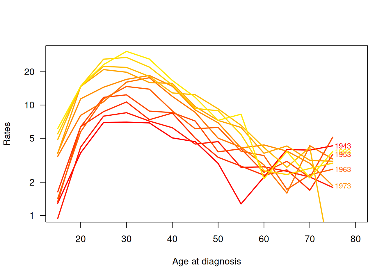
What is your broad impression about the trend in the the age-specific incidence rates over calendar time? What about the effect of age; is there any common pattern in the age-incidence curves across the periods?
8.3 Age and period as categorical factors
We shall first fit a Poisson regression model with log link on age and period in the traditional way, in which both factors are treated as categorical. The model is additive on the log-hazard scale: \[ \log(h_{jk}) = \mu + \alpha_j + \beta_k, \quad j=1, \dots, 14; k=1, \dots, 12, \] where \(h_{jk}\) is the hazard rate in age group \(j\) and period \(k\). Each \(\alpha_j\)s is the logarithm of the rate ratio between age group \(j\) and the reference age group \(1 = 15-19\) years, and \(\beta_k\) is the log(rate-ratio) between period \(k\) and period \(1 = 1943-47\). The intercept parameter is the log-hazard at the combination of the reference levels chosen for age and period – It is useful to scale the person-years to be expressed in \(10^5\) y.
- In fitting the model we utilize the
poisregfamily object found in packageEpi.
tdk$Y <- tdk$Y / 100000
mCat <- glm(cbind(D, Y) ~ Age + Per,
  family = poisreg(link = log), data = tdk )
round(ci.exp(mCat), 2)
## exp(Est.) 2.5% 97.5%
## (Intercept) 1.47 1.26 1.72
## Age[20,25) 3.13 2.75 3.56
## Age[25,30) 4.90 4.33 5.54
## Age[30,35) 5.50 4.87 6.22
## Age[35,40) 4.78 4.22 5.42
## Age[40,45) 3.66 3.22 4.16
## Age[45,50) 2.60 2.27 2.97
## Age[50,55) 1.94 1.68 2.25
## Age[55,60) 1.47 1.25 1.72
## Age[60,65) 0.98 0.82 1.18
## Age[65,70) 0.92 0.76 1.12
## Age[70,75) 0.90 0.73 1.12
## Age[75,80] 0.86 0.67 1.11
## Per[1948,1953) 1.12 0.96 1.30
## Per[1953,1958) 1.30 1.13 1.50
## Per[1958,1963) 1.53 1.33 1.76
## Per[1963,1968) 1.68 1.47 1.92
## Per[1968,1973) 1.98 1.74 2.25
## Per[1973,1978) 2.33 2.05 2.64
## Per[1978,1983) 2.66 2.35 3.01
## Per[1983,1988) 2.83 2.50 3.20
## Per[1988,1993) 3.08 2.73 3.47
## Per[1993,1998] 3.31 2.93 3.74What do the estimated rate ratios tell about the age and period effects?
- A graphical inspection of point estimates and confidence intervals
can be obtained using function
matplot()in thegraphicspackage of R. In the beginning it is useful to define shorthands for the pertinent mid-age and mid-period values of the different intervals
aMid <- seq(17.5, 77.5, by = 5)
pMid <- seq(1945, 1995, by = 5)
par(mfrow=c(1,2))
matplot(aMid, rbind(c(1,1,1), ci.exp(mCat)[2:13, ]), type = "o", pch = 16,
   log = "y", cex.lab = 1.5, cex.axis = 1.5,
   col = c("black", "blue", "blue"),
  xlab = "Age (years)", ylab = "Rate ratio" )
matplot(pMid, rbind(c(1,1,1), ci.exp(mCat)[14:23, ]), type = "o", pch = 16,
   log = "y", cex.lab = 1.5, cex.axis = 1.5,
   col = c("black", "blue", "blue"),
  xlab = "Calendar year - 1900", ylab = "Rate ratio" )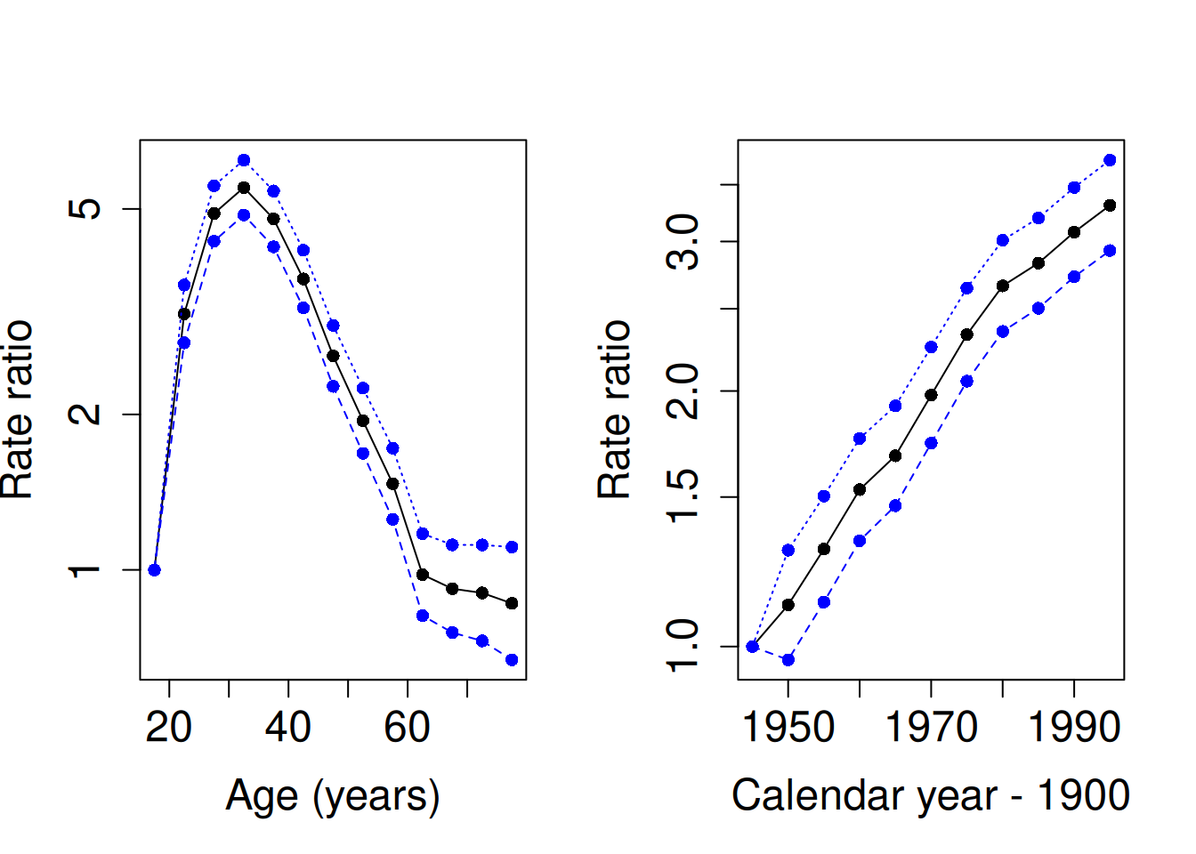
- In the fitted model the reference category for each factor was the
first one. As age is the dominating factor, it may be more
informative to remove the intercept from the model. As a consequence
the exponentiated age parameters actually describe fitted hazard
rates for the age groups, each at a chosen reference level of the
period factor. For the latter it is now convenient to choose the
middle period 1968-72 using function
Relevel()inEpi.
tdk$Per70 <- Relevel(tdk$Per, ref = 6)
mCat2 <- glm(cbind(D, Y) ~ -1 + Age + Per70,
  family = poisreg(link = log), data = tdk )
round(ci.exp(mCat2), 2)
## exp(Est.) 2.5% 97.5%
## Age[15,20) 2.91 2.55 3.33
## Age[20,25) 9.12 8.31 10.01
## Age[25,30) 14.28 13.11 15.55
## Age[30,35) 16.03 14.72 17.46
## Age[35,40) 13.94 12.76 15.23
## Age[40,45) 10.66 9.71 11.71
## Age[45,50) 7.57 6.83 8.39
## Age[50,55) 5.67 5.05 6.36
## Age[55,60) 4.28 3.75 4.88
## Age[60,65) 2.85 2.43 3.35
## Age[65,70) 2.68 2.25 3.19
## Age[70,75) 2.63 2.16 3.20
## Age[75,80] 2.51 1.98 3.18
## Per70[1943,1948) 0.51 0.44 0.58
## Per70[1948,1953) 0.57 0.50 0.64
## Per70[1953,1958) 0.66 0.58 0.74
## Per70[1958,1963) 0.77 0.69 0.87
## Per70[1963,1968) 0.85 0.76 0.95
## Per70[1973,1978) 1.18 1.07 1.30
## Per70[1978,1983) 1.35 1.22 1.48
## Per70[1983,1988) 1.43 1.30 1.57
## Per70[1988,1993) 1.56 1.42 1.70
## Per70[1993,1998] 1.67 1.53 1.84- Let us also plot estimates from the latter model, too. – NB. The bug in the previous version of the exercise is now fixed, so that the estimated age-specific incidence rates averaged over the calendar periods are now correctly plotted.
par(mfrow = c(1, 2))
matplot(aMid, ci.exp(mCat2)[1:13, ], type = "o", pch = 16, lwd=c(2,1,1),
   log = "y", cex.lab = 1.5, cex.axis = 1.5,
   col = c("black", "blue", "blue"),
  xlab = "Age (years)", ylab = "Rate" )
matplot(pMid, rbind(ci.exp(mCat2)[14:18, ],
                    c(1,1,1), ci.exp(mCat2)[19:23, ]),
        type = "o", pch = 16, log = "y", cex.lab = 1.5, cex.axis = 1.5,
         col = c("black", "blue", "blue"),
        xlab = "Calendar year - 1900", ylab = "Rate ratio" )
abline(h = 1, col = "gray")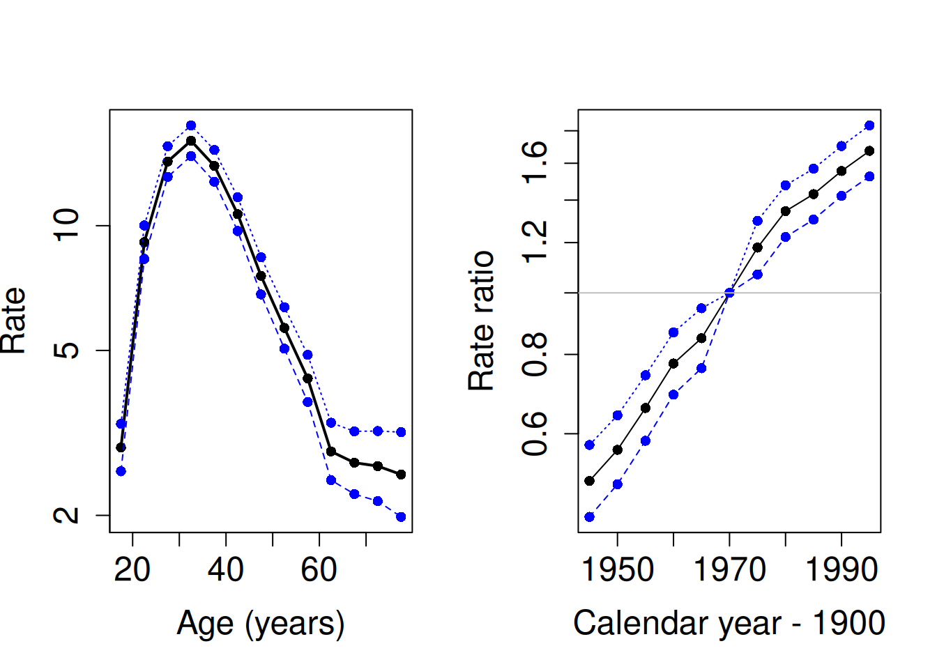
8.4 Generalized additive model with penalized splines
It is obvious that the age effect on the log-rate scale is highly non-linear. Yet, it is less clear whether the true period effect essentally deviates from linearity. Nevertheless, there are good reasons to try fitting a generalized additive model (GAM), the systematic part of which containing the sum of smooth continuous functions of the two time scales: \[ \log \{h(A,P)\} = \mu + s_1(A) + s_2(P), \] where the logarithm of the hazard \(h(A,P)\) depends on continuous age \(A\) (years) and calendar year \(P\) via smooth functions \(s_1(A)\) and \(s_2(B)\).
- As the next task we fit the above defined GAM assuming the Poisson
family as before for the random component. Here the principle of
penalized splines (see Martyn’s lecture) is applied using function
gam()in packagemgcvwith its default settings. In this fitting an optimal value for the penalty parameter is chosen based on an AIC-like criterion known as UBRE (‘Un-Biased Risk Estimator’)
mPen <- mgcv::gam(cbind(D, Y) ~ s(A) + s(P),
  family = poisreg(link = log), data = tdk
)
summary(mPen)
##
## Family: poisson
## Link function: log
##
## Formula:
## cbind(D, Y) ~ s(A) + s(P)
##
## Parametric coefficients:
## Estimate Std. Error z value Pr(>|z|)
## (Intercept) 1.70960 0.01793 95.33 <2e-16 ***
## ---
## Signif. codes: 0 '***' 0.001 '**' 0.01 '*' 0.05 '.' 0.1 ' ' 1
##
## Approximate significance of smooth terms:
## edf Ref.df Chi.sq p-value
## s(A) 8.143 8.765 2560 <2e-16 ***
## s(P) 3.046 3.790 1054 <2e-16 ***
## ---
## Signif. codes: 0 '***' 0.001 '**' 0.01 '*' 0.05 '.' 0.1 ' ' 1
##
## R-sq.(adj) = 0.598 Deviance explained = 53.6%
## UBRE = 0.082051 Scale est. = 1 n = 3510The summary is quite brief, and the only estimated coefficient is the
intercept \(\mu\), which sets the baseline level for the log-rates,
against which the relative age effects and period effects will be
contrasted. On the hazard rate scale the baseline level 5.53 per 100000
y is obtained byexp(1.7096).
- See also the default plot for the fitted curves (solid lines) describing the age and the period effects which are interpreted as contrasts to the baseline level on the log-rate scale.
The dashed lines describe the approximate 95% confidence band for the
pertinent curve. One could get the impression that 1968 were
intentionally the reference year for the period effect, almost like
period 1968-72 chosen as the reference in the categorical model that was
previously fitted. This is not quite the case, however. By default
gam() parametrizes the spline effects such that the intercept \(\mu\),
at which the spline effects are nominally zero, is the overall grand
mean value of the log-hazard in the data. This corresponds to the
principle of sum contrasts (contr.sum) for categorical explanatory
factors. It just happens here that the horizontal location of the grand
mean for the period effect is approximately year 1968
From the summary you will also find that the degrees of freedom value
required for the age effect is nearly the same as the default dimension
\(k-1 = 9\) of the part of the model matrix (or basis) initially allocated
for each smooth function. (Here \(k\) refers to the relevant argument that
determines the basis dimension when specifying a smooth term by s() in
the model formula). On the other hand the period effect takes just about
3 df.
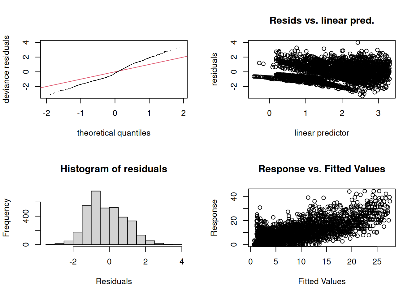
- It is a good idea to do some diagnostic checking of the fitted model

##
## Method: UBRE   Optimizer: outer newton
## full convergence after 7 iterations.
## Gradient range [-9.387549e-10,1.362e-06]
## (score 0.0820511 & scale 1).
## Hessian positive definite, eigenvalue range [0.0002209238,0.0003823997].
## Model rank =  19 / 19
##
## Basis dimension (k) checking results. Low p-value (k-index<1) may
## indicate that k is too low, especially if edf is close to k'.
##
##        k'  edf k-index p-value
## s(A) 9.00 8.14    0.93  <2e-16 ***
## s(P) 9.00 3.05    0.95    0.08 .
## ---
## Signif. codes:  0 '***' 0.001 '**' 0.01 '*' 0.05 '.' 0.1 ' ' 1
The four diagnostic plots are analogous to some of those used in the
context of linear models for Gaussian responses, but not all of them may
be as easy to interpret. – Pay attention to the note given in the
printed output about the value of k.
- Let us refit the model but now with an increased
kfor age. Take a look at the summary, especially the degrees of freedom for age.
mPen2 <- mgcv::gam(cbind(D, Y) ~ s(A, k = 20) + s(P),
  family = poisreg(link = log), data = tdk
)
summary(mPen2)
##
## Family: poisson
## Link function: log
##
## Formula:
## cbind(D, Y) ~ s(A, k = 20) + s(P)
##
## Parametric coefficients:
## Estimate Std. Error z value Pr(>|z|)
## (Intercept) 1.70863 0.01795 95.17 <2e-16 ***
## ---
## Signif. codes: 0 '***' 0.001 '**' 0.01 '*' 0.05 '.' 0.1 ' ' 1
##
## Approximate significance of smooth terms:
## edf Ref.df Chi.sq p-value
## s(A) 11.132 13.406 2553 <2e-16 ***
## s(P) 3.045 3.788 1054 <2e-16 ***
## ---
## Signif. codes: 0 '***' 0.001 '**' 0.01 '*' 0.05 '.' 0.1 ' ' 1
##
## R-sq.(adj) = 0.599 Deviance explained = 53.7%
## UBRE = 0.081809 Scale est. = 1 n = 3510With this choice of k the df value for age became about 11, which is
well below \(k-1 = 19\). – Take a look at the diagnostic plots, too
##
## Method: UBRE   Optimizer: outer newton
## full convergence after 6 iterations.
## Gradient range [-2.396066e-12,2.901858e-09]
## (score 0.08180917 & scale 1).
## Hessian positive definite, eigenvalue range [0.00022158,0.0009322215].
## Model rank =  29 / 29
##
## Basis dimension (k) checking results. Low p-value (k-index<1) may
## indicate that k is too low, especially if edf is close to k'.
##
##         k'   edf k-index p-value
## s(A) 19.00 11.13    0.93    0.01 **
## s(P)  9.00  3.05    0.95    0.10
## ---
## Signif. codes:  0 '***' 0.001 '**' 0.01 '*' 0.05 '.' 0.1 ' ' 1
Plot also the fitted curves obtained from this model.
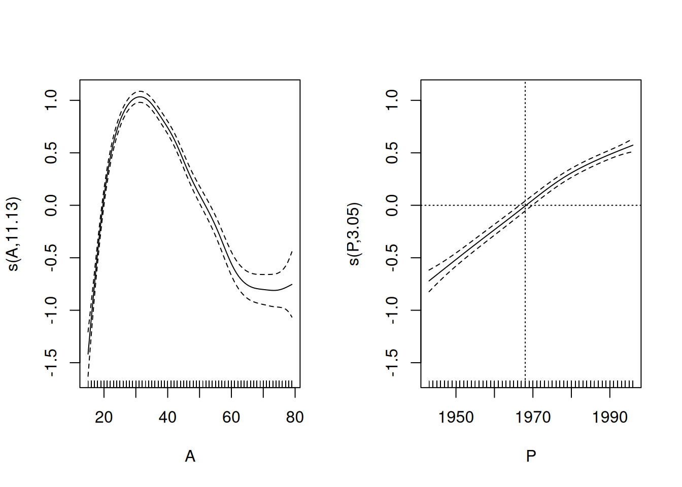
There does not seem to have happened any essential changes from the previously fitted curves. – Maybe, after all, 8 df could be quite enough for the age effect.
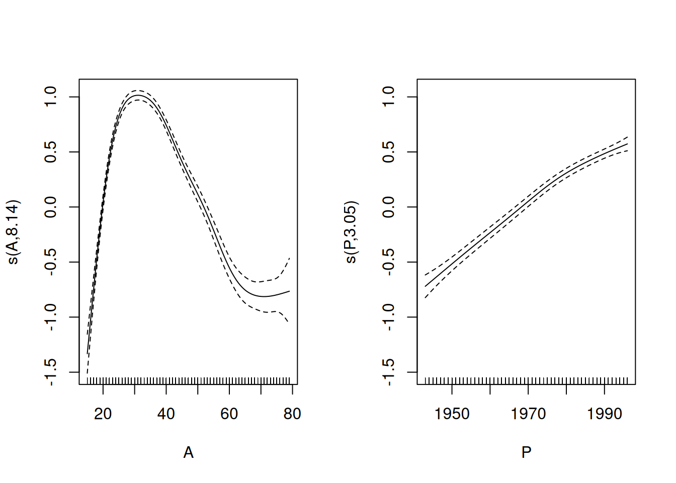
- Graphical presentation of the effects using
plot.gam()can be improved. For instance, we may present the age effect to describe the mean incidence rates by age, averaged over the whole time span of 54 years. This is obtained by adding the estimated grand mean or intercept 1.71 = log(5.53) to the estimated values of the smooth curve describing the age effect and expressing the \(y\)-coordinates to represent the actual hazard (the scale still being logarithmic). For that purpose we need to extract the intercept and modify the labels of the \(y\)-axis accordingly. The estimated period curve can also be expressed in terms of indidence rate ratios in relation to the fitted baseline rate, as determined by the model’s intercept.
icpt <- coef(mPen2)[1]
par(mfrow = c(1, 2))
plot(mPen2,
  seWithMean = TRUE, select = 1, rug = FALSE,
  yaxt="n",  ylim = c(log(1), log(20)) - icpt,
  xlab = "Age (y)", ylab = "Mean rate (/100000 y)"
)
axis(2, at = log(c(1, 2, 5, 10, 20)) - icpt,
     labels = c(1, 2, 5, 10, 20))
abline(h = 0, lty=3)
plot(mPen2,
  seWithMean = TRUE, select = 2, rug = FALSE,
  yaxt = "n", ylim = c(log(0.4), log(2)),
  xlab = "Calendat year", ylab = "Relative rate"
)
axis(2, at = log(c(0.5, 0.75, 1, 1.5, 2)),
     labels = c(0.5, 0.75, 1, 1.5, 2))
abline(v = 1968, h = 0, lty = 3)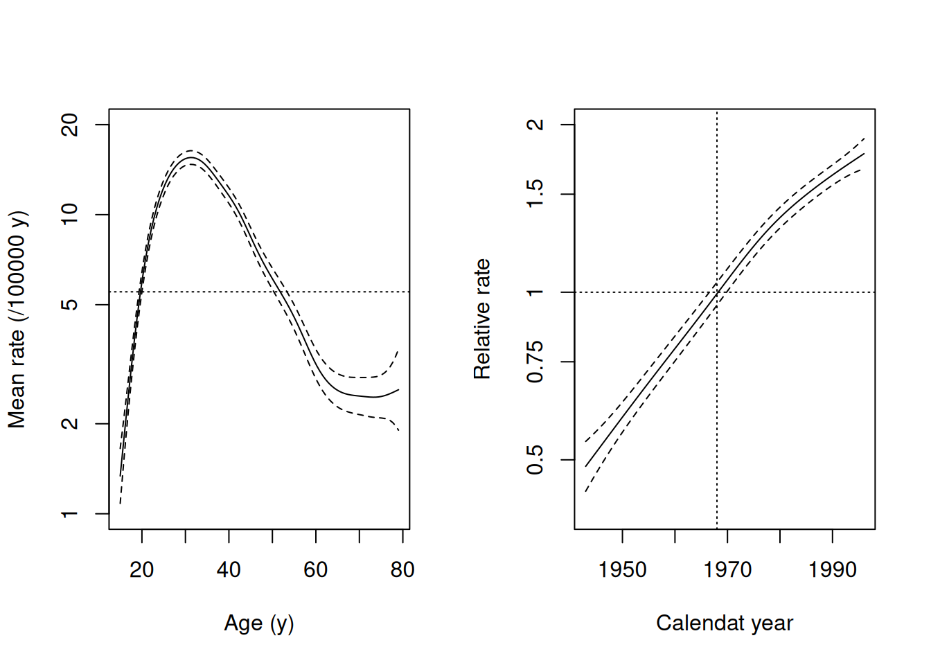
Homework You could continue the analysis of these data by fitting an
age-cohort model as an alternative to the age-period model, as well as
an age-cohort-period model utilizing function apc.fit() in Epi. See
(http://bendixcarstensen.com/APC/) for details.